It’s not simple to create simplicity. The official definition says that simplicity is the characteristic of a lack of complexity or complication.
Most of us feel the need to add ever more details, points and messages. We get the feeling, arising from fear, that we will not be understood if we leave out that one other point. We think someone might get the impression we do not have enough important things to say if we do not add another anecdote. That’s why minimizing text, visuals, elements or ideas is much harder than adding them. Believe me, I know. It’s well known that David Ben-Gurion once said that he didn’t had time to write a short speech, so he wrote a long one.
The beauty of design is that simplicity helps with precision and refining the message. Not to the point of cliché, but at the practical level. The approach in design is to remove more and more items until the message is no longer understood. The eraser works overtime. Once the message is no longer clear, it’s an indication that you too much and you should start putting things back.
This can be seen in the font-based icon or logo design. We try to hide a part of a letter, in order to create something symbolic. But sometimes we go too far and it’s no longer clear what the letter is. The same is true for compositions, colors or backgrounds. I have had many clients tell me “the background is empty,” when I leave a lot of white space. In that case, I reply that the background is letting the object breath.
Simplicity is reflected not only in the implementation of the design, but also in the conceptual stage. Will a lone image do the job or should we add an explanation? Does the text add to it? Make it worse? Or does it change the meaning? These questions don’t have a single answer. It all depends on their context, message and character.
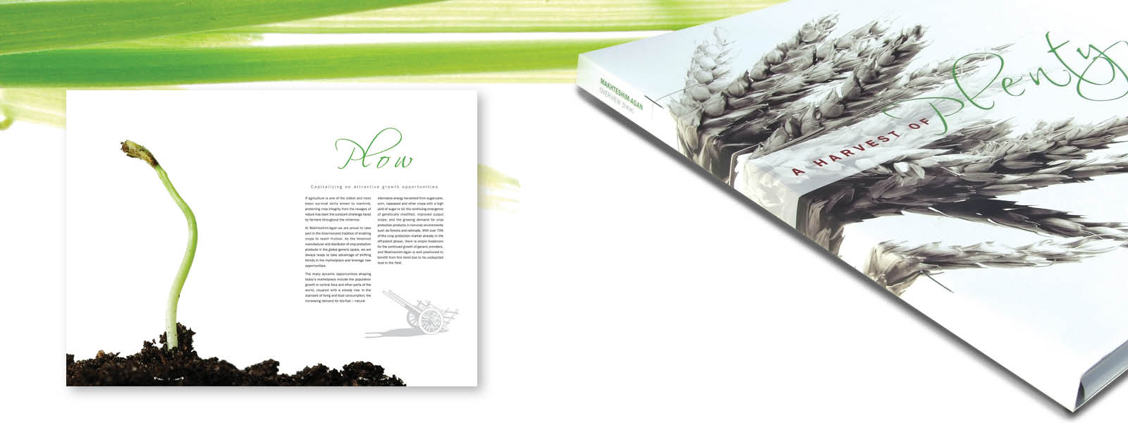
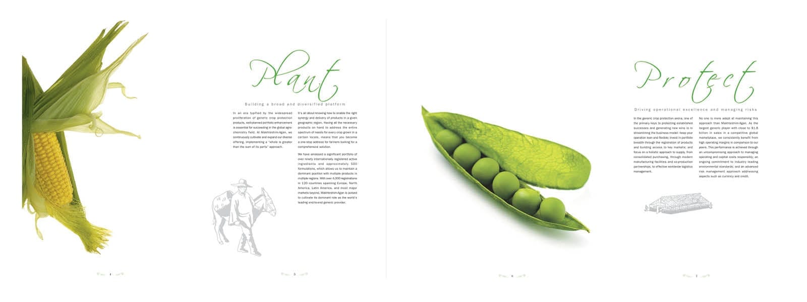
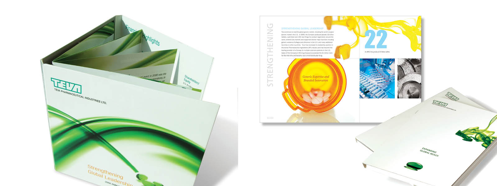
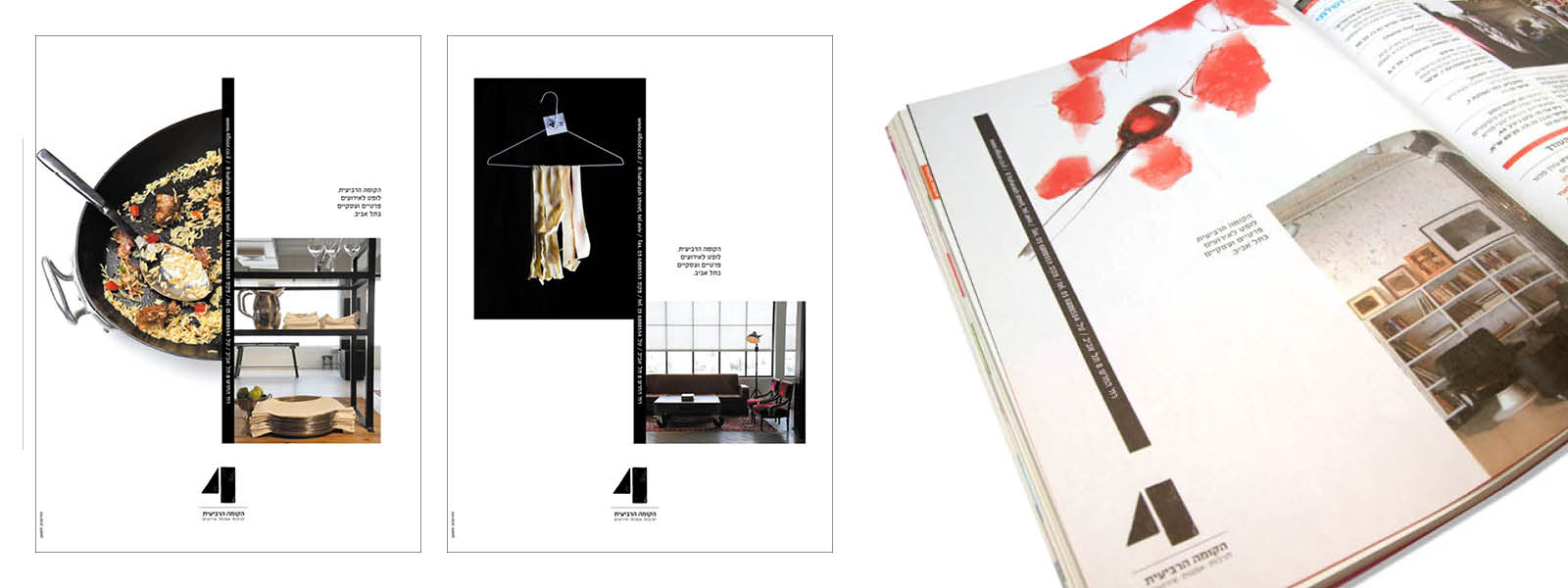
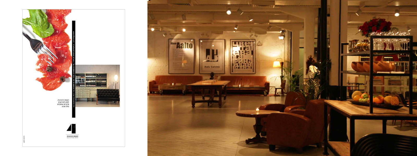
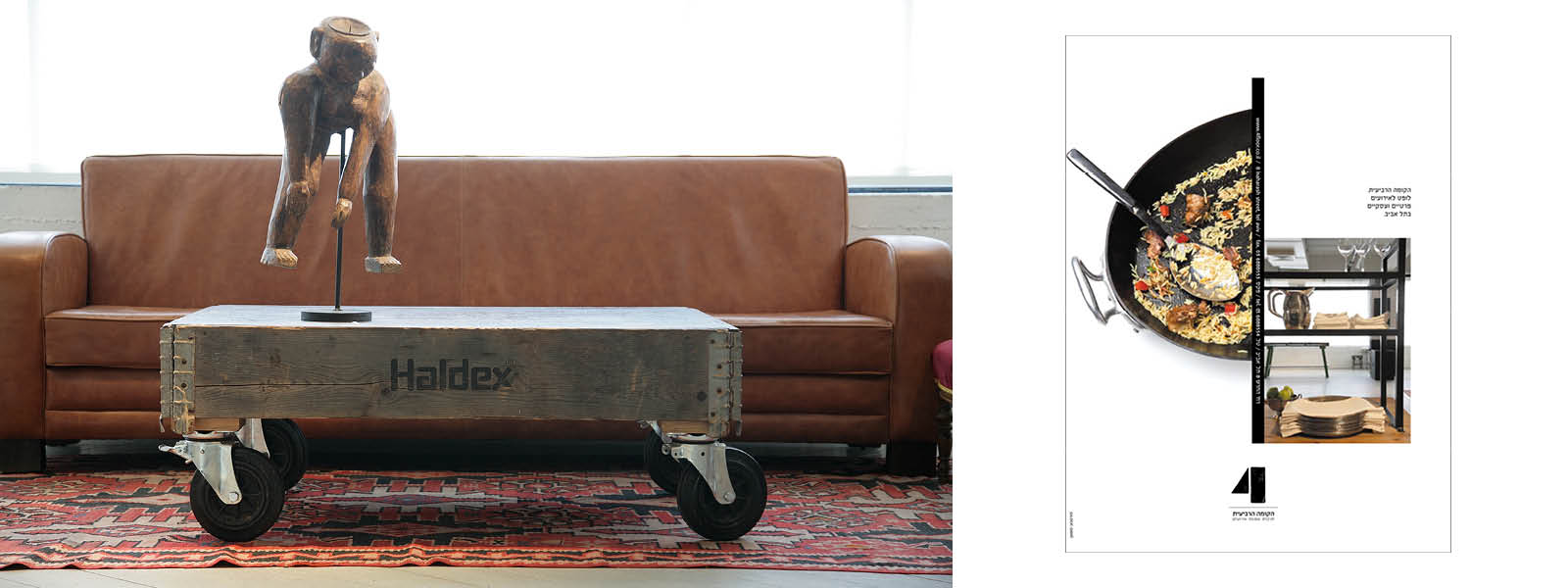
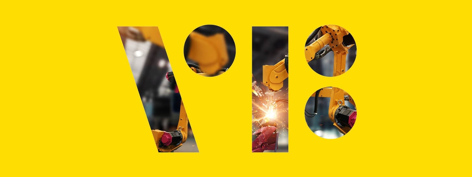
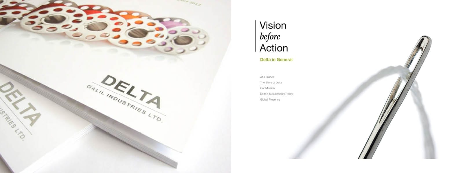
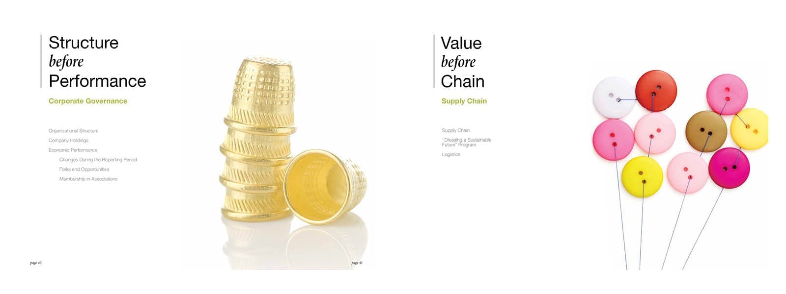
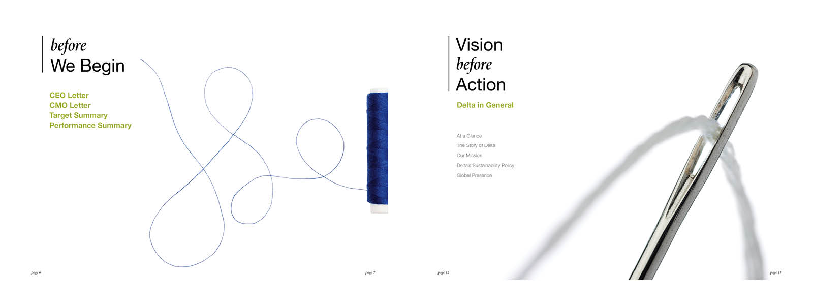
The projects in this category demonstrate how the choice of a few elements can tell a whole story. Whether it’s a report by Adama, collateral for TEVA using water stains to symbolize global expansion, or dramatic ads by The 4 Floor combine food and culture, and make a statement. In the Delta Galil project, we told a story using a single sentence or element. And the last project, the logo of Visual Factories, was a distillation of the rhythm and shapes found on a factory floor.