We are flooded with information every day, from morning to evening. News, newspapers, work, children. Everywhere and from every platform. It is very difficult to absorb, process, understand and remember such a large amount of information, to understand what is important and what is not, to distinguish between central and side issues, and to draw meaning from all of that data. This is where the infographic comes into the picture.
Infographics are a visual representation of information. With the help of a visual narrative built from graphic elements and short text, we convey a message we want to be understood correctly and quickly. Information is knowledge in the form of words, numbers or concepts that help us communicate. Usually, data tends to be associated with quantitative information, but of course one can also design qualitative information.
Wherever it is recognized that messages are absorbed faster through images, because our brain picks up information much quicker through the visual system, the use of infographics shortens processes and explains things much more precisely and correctly. In an age of information overload, the mind looks for shortcuts. As such, it is accustomed to absorbing patterns, contrasts and instructions, making it easier to understand messages through infographics.
In the end, we all want to communicate better. No matter what role we are in, we all want to be understood and to understand others. Infographics help us to simplify, explain, describe, persuade, attract attention, clarify, make accessible, make decisions, and understand things in context.
Decorative storytelling or direct data?
In designing infographics, there are two approaches. One is exemplified by Professor Edward Tufte of Yale University, who argues that everything should be as clean and close to the data as possible, without unnecessary design embellishments. The second, by British graphic designer Nigel Holmes, who is in favor of the widespread use of graphic and even decorative elements, because it attracts people to delve into the data and to read everything.
How do infographics work?
With the help of tools from the world of design, a narrative or article becomes knowledge built from images, icons, numbers or anything else that conveys the visual story in a way that is faithful to the original. A kind of visual journalism.
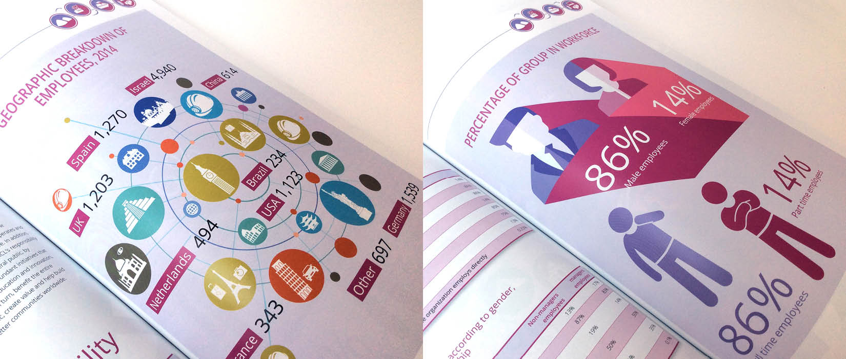
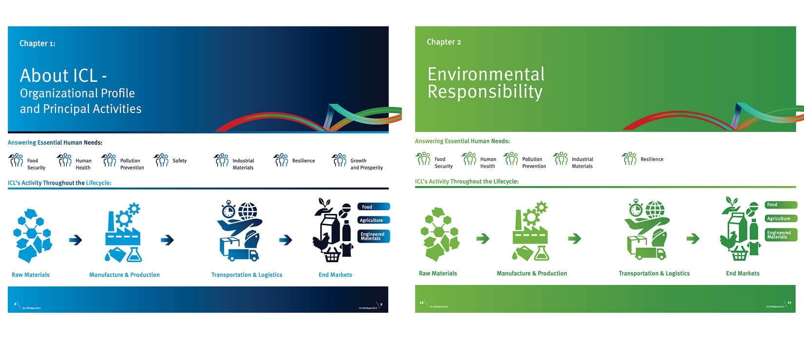
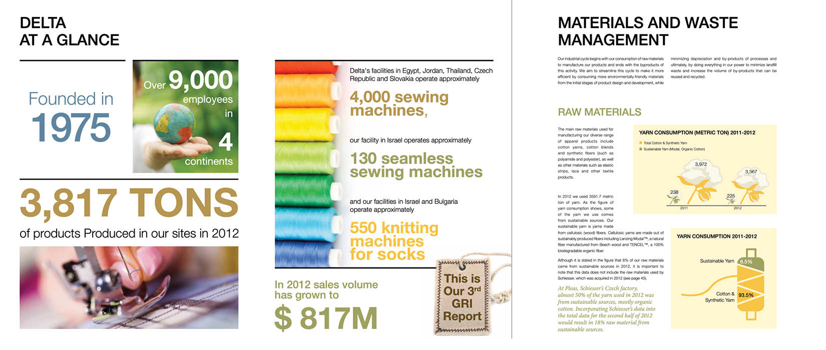
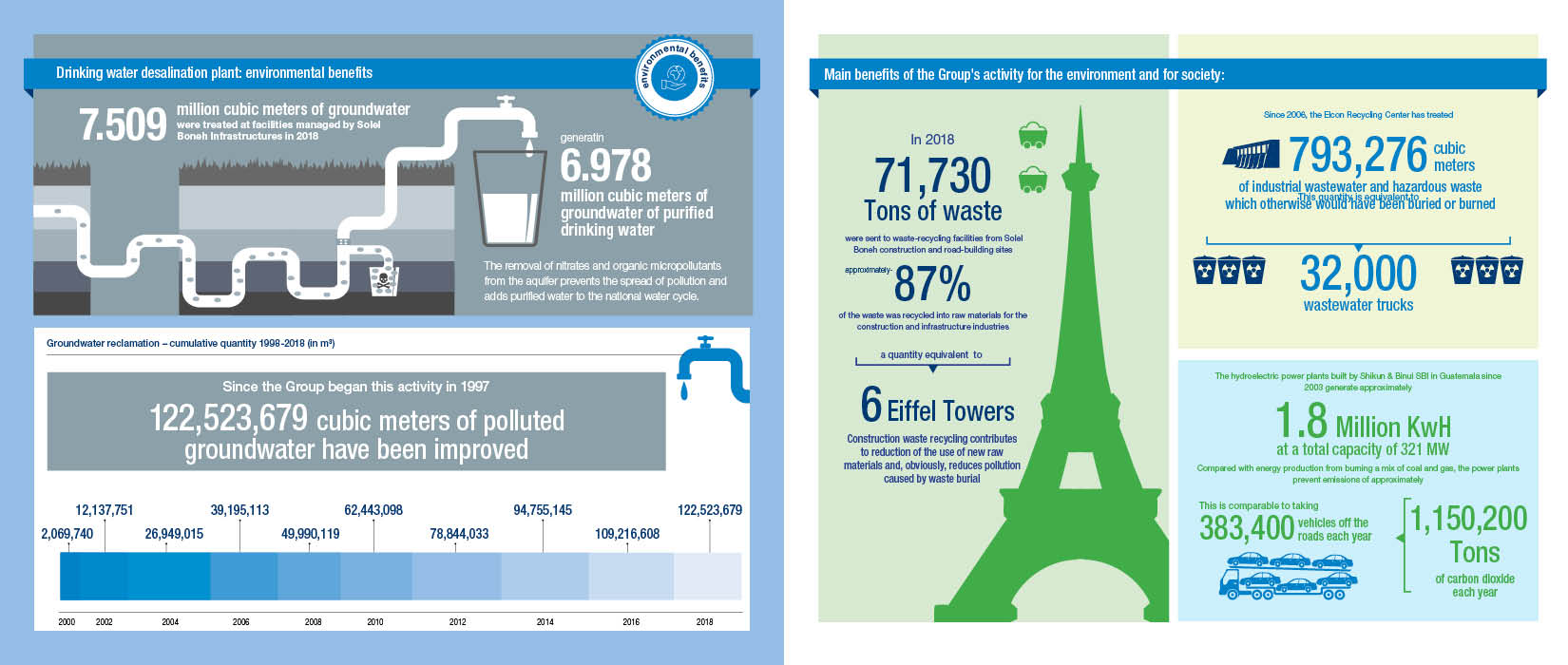
A color system creates a thematic hierarchy. Different sizes and shapes create division into groups. Icons that are associatively linked to universal themes tell us a story that we pick up in seconds. Understanding the content allows us to build a hierarchy of information – which elements are more important and therefore appear earlier or larger, and which are less so. Flowcharts explain how things develop and progress, comparing data allows us to see the difference between two options, and graphs, maps and dates tell us a story.
After you dive into our work, you’re welcome to jump over to reading about the things I learned at a workshop with a world leader in the field of infographics, David McCandless (here), and how I got to be his assistant (here).