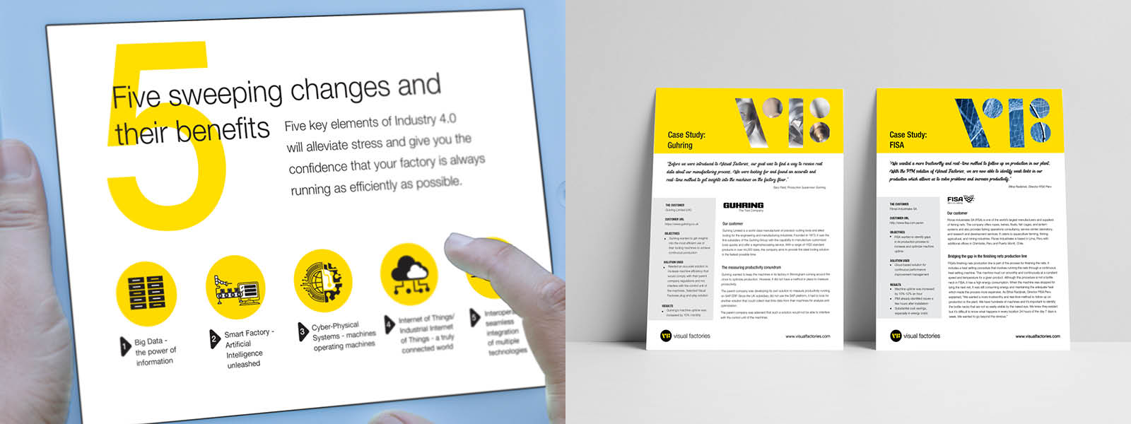
Visual Factories Branding – Enabling the Manufacturing World of Tomorrow - Today.
Visual Factories
Designed by manufacturers for manufacturers, VF’s optimization tool was developed by Industry 4.0 and IIoT experts, who built the solution based upon a deep understanding of the true pain points of floor machinery operation. Inspired by decades of hands-on manufacturing operations experience, VF presents a straightforward, cloud-based solution that offers the management of any type of factory the tools to enhance and improve overall productivity.
Impact through Design
How is a logo built from what is seen on the ground?
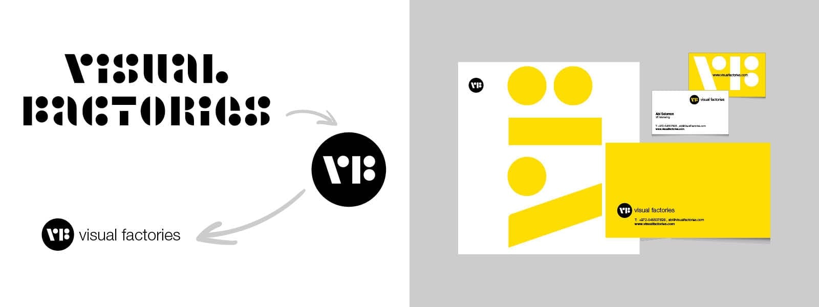
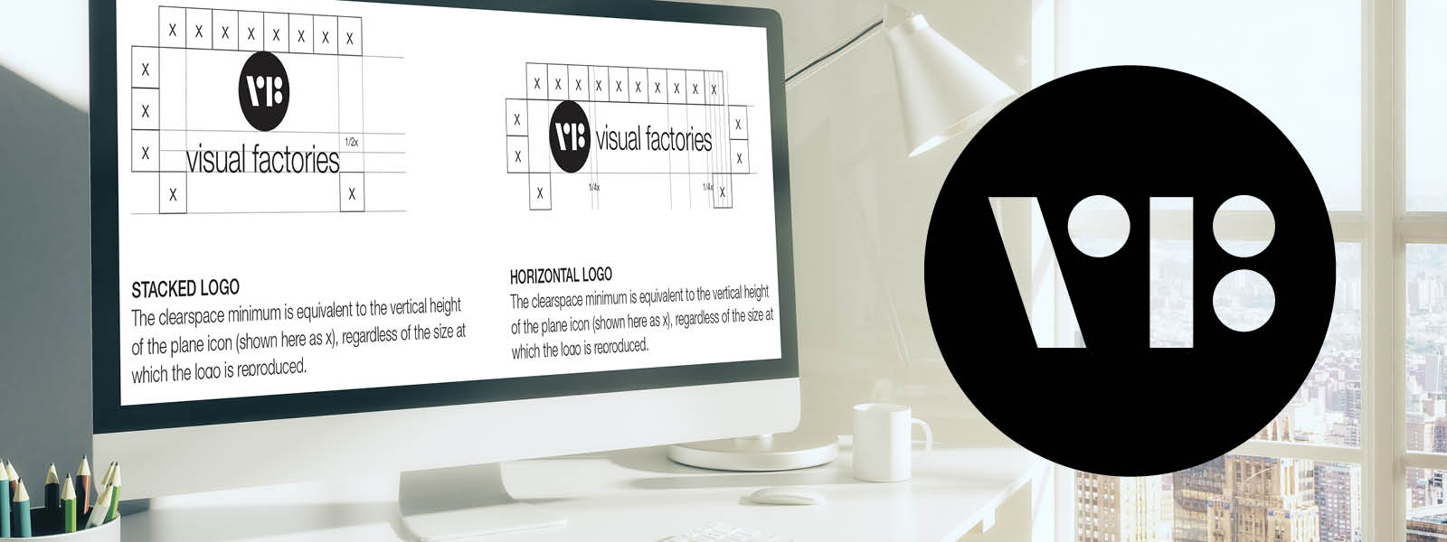
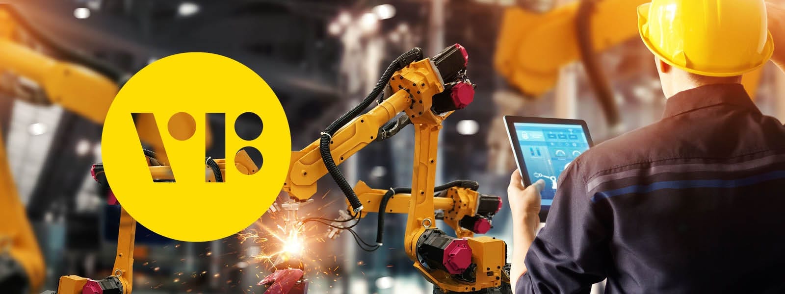
Upon our return from tours of the factories, the loud noise of the machines still reverberated in our ears. It was clear that this sound had to be translated visually. We also understood, from our conversation with the company’s production experts and managers, that it is critical to know whether a machine is working or not. To represent that feeling, we selected a font transmitting rhythm and reminiscent of the binary system: on or off. This situation may be considered routine in some places, but when there are dozens of machines on the floor it is difficult to locate which has broken down and what exactly has gone wrong. Every such stoppage means money. We took all these insights and aimed at a simple binary solution: yes/no, based on elementary shapes. Appearance reminiscent of an on/off button.
Seeing yellow everywhere:
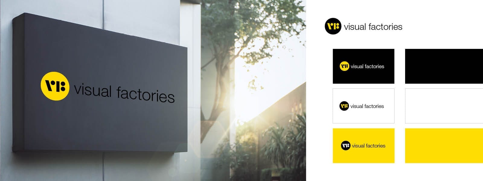
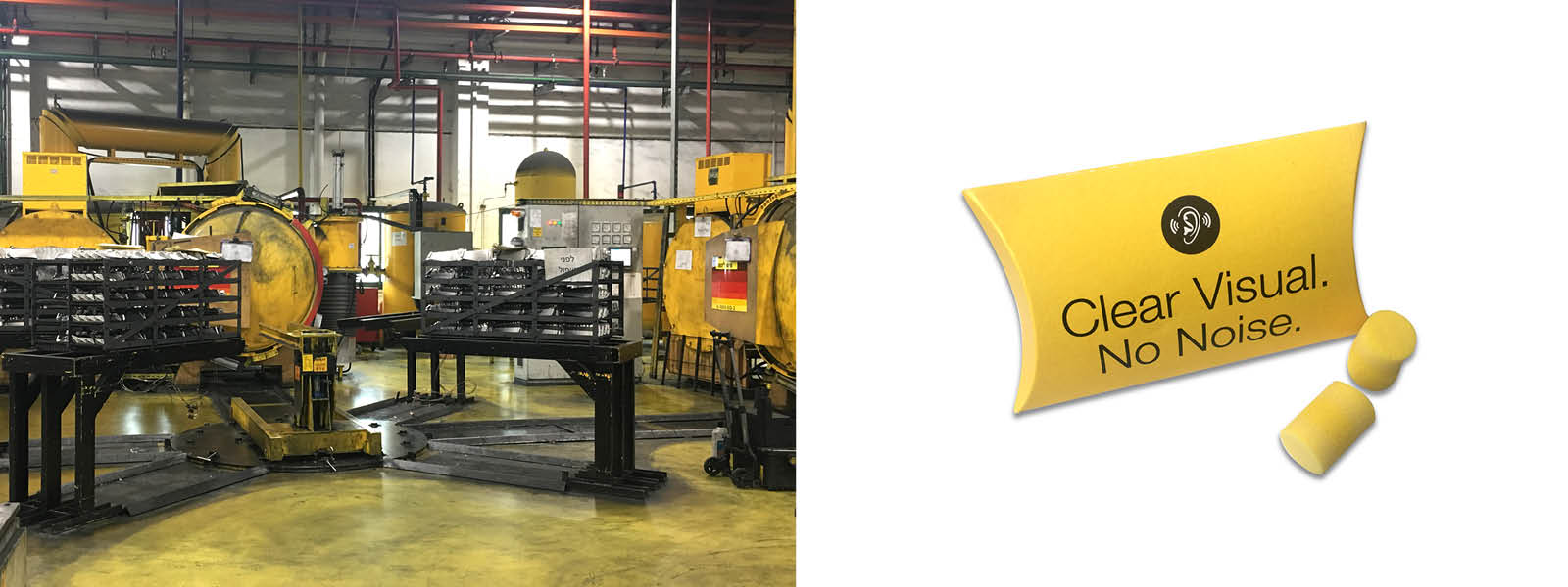
During those same visits to the factories in the north, we noticed the yellow everywhere. Lots of yellow: warning signs, alarm signals, safety jackets and even parts of the floor – everything is yellow. That is how yellow became part of the palette of the colors and the logo.
“Business as usual” cannot not be sustainable in today’s dynamic world:
Automation and digitization are taking over the work place. In order to close the gap for the traditional industries in this area, to toe the line with the present, and to assure their relevance in the future, a solution was required that understands the factories’ operating complexity. The solution had to consist of simple and efficient processes, the ability to resolve challenges “on the fly” which must come from the field, that is to say – from the bottom up. Since we are talking about a revolution in this world of content, and in order to leap to the future quickly, we selected the colors yellow and black, and a clean, precise and clear design line – working or not working.
